Turning over a new leaf
We are delighted to share with you an update about our ‘public face’. As many of you will know, our Cooperative and brand has been around since 2004. A lot has changed in that time – including us! Our Board decided that as part of our strategic refresh we would also refresh our look and feel.
We were delighted to collaborate with experienced local designer, Alex Lloyd, to update our brand imagery to be more in keeping with our future direction. We wanted to take the time to share the story behind this refresh…
What’s the big idea?
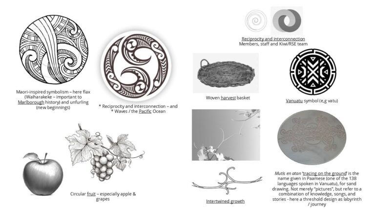
The new brand imagery takes inspiration from many facets of our work:
The design – making a mark
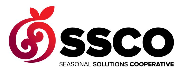
Alex has distilled these ideas into the new logo and brand icon, as seen below.
Two reflective koru bring an ‘organic’ and truly Kiwi aesthetic to the identity – forming an almost harmonious natural balance in the vein of the yin and yang; a visual representation of the complementary, interconnected and unifying nature of the cooperative.
It includes concepts of:
- Reciprocity and interconnection (of our members, our Kiwi /RSE workers, and our SSCO staff – working together for collective goals)
- Seasonality and growth – fruit and vine (linking in with our primary industry connection)
- A sense of place (NZ / Pacific style: connecting to ‘place’)
Colours that capture a personality
The style has a scarlet and burgundy colour palette applied.
This connects to many natural references – including the changing seasons (like autumnal leaves at “harvest” time); and ripening fruit crops (such as ripe apples, cherries and red grapes).
It also connects to the red in the New Zealand flag (as well as the Vanuatu flag, and many others in the Pacific). Furthermore, it provides a nod to red wine and the iconic Kiwi red Pohutukawa.
Look out for this new look popping up all over the place…
A big thanks to Alex Lloyd for helping us distil our ideas into a visual representation of our Cooperative – in preparation for the next stage of our journey!